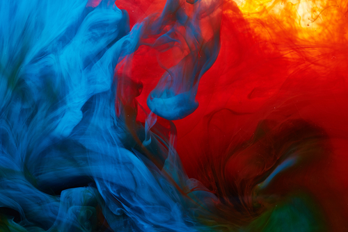
What use is there for exploring coloring apps? Do you really need to choose the perfect palettes for your projects? Do I really need to learn about color theory to enjoy a simple coloring book app like iColor?
Here’s some good news: you can learn all of these things as you go along with coloring the simple projects provided in the iColor coloring book app. But, wouldn’t you want a leg up on the competition?
We’re here to discuss color palettes and how to pick the perfect ones with a side trip delving into color theory, symbolism, and application.
Without further ado, let’s get started.
Color Theory: Why Is It Important?
First off, let’s start with color theory and why it’s important. Learning about color theory and color palettes not only helps you create better pictures, but it also lets you understand why one color works best with another.
We all know about the three primary colors: blue, red, and yellow.
But what about the other degrees of color between those three?
Color theory is a practical guide to color mixing and the visual effects of color combinations. Colors are defined as either primary, secondary or tertiary colors in a wheel diagram.
This practice started in the 18th century although its history of practical usage extends further back to the 1400s. This is based on the writings of Leone Battista Alberti and Leonardo da Vinci.
The Basics Of Color Theory
Before we start with this section, let’s get a few terminologies out of the way so we’re all on the same page. This will help you understand what we’re talking about better and perhaps make you sound like more of an expert when talking to other coloring book enthusiasts.
Chroma
In color theory, chroma refers to the degree of vividness of a color, or how pure it is compared to its representative on the color wheel. It can also be called saturation, or color intensity. Understanding chroma is essential for creating the Munsell color mixing chart, which relies on a 16-step chroma sequence.
Hue
This describes a pure color found in the color wheel like red or blue. It is the pigment in its basest form without tint or shade (addition of white or black pigment respectively)
Examples: red, yellow, green, cyan, blue, magenta
Saturation
This falls under the scope of chroma but in the interest of being more specific, saturation refers to the strength or weakness of a particular color.
Shade
Shade is the act of adding the color black to a pure hue. This creates a richer, darker, more intense color. Care should be taken because black is a very intense color that can easily overpower an entire section. For best results, add shade to portions in small increments or graduations to add more depth and dimension while still getting the desired results.
Tint
The direct opposite of shade, tint is the act of adding white to a hue. This lightens or desaturates a pure hue.
Tone
Tone is created by adding grey to a pure hue. This is basically the combination of black and white to produce the color grey which is then added to the pure hue to get the desired result.
Tone can be manipulated by the amount of white and black in the mix. This can result in a color that is either lighter or darker depending on the amount and quality of grey added.
Value
This pertains to how light or dark a color is.
Colors within the same hue spectrum with slight variations are often distinguished using adjectives referring to their lightness or colorfulness. For example, the color red can also be expressed in this manner: dark red, light red, faint red, and so on.
Ok, now that we’ve gotten all those things out of the way, let’s head on to color palettes.
Four Main Types Of Color Palettes
Another thing we have to get out of the way is understanding what color palettes are. There are four main types of color palettes that you need to know.

Analogous
An analogous palette consists of the main color and a progression of degrees from either side of it in the color wheel. You’re still basically working with one color but it progresses in value based on tint, shade, or tone. There is no major disconnection from the main hue presented in the color wheel.
An example would be a slow progression from the main color to a lighter representation, reaching but not limited to pink.
Complementary
Complementary colors are opposites. Colors like red and green or blue and orange are direct opposites. To expand these, you can add various tints, shades, and tones to cover the graduations in between the polar opposites. This helps in avoiding glaring contrast between your two main colors.
Monochromatic
The monochromatic color palette uses only one color (or hue). This is the simplest color palette you can use. Variations of the color are created by changing the value and saturation of the base hue. When done right, the results can be amazing. When done poorly, outright boring or ugly.
Triadic
This color palette uses three hues from equidistant points on the color wheel. A good example is red, yellow, and blue. This results in a more diverse palette. Needless to say, this is a more complicated palette to work with and a lot of experimentation is needed to get things right.
Ok, we said four. But, here’s another one just for good measure.
Achromatic
Achromatic colors refer to any hue that is neutral or near neutral. This palette includes browns, tans, pastels, and darker colors. Pure achromatic colors include black, white, and all greys.
This can be achieved by mixing pure colors with white, black, or grey. It can also be achieved by mixing two complementary colors. This produces an unsaturated hue.
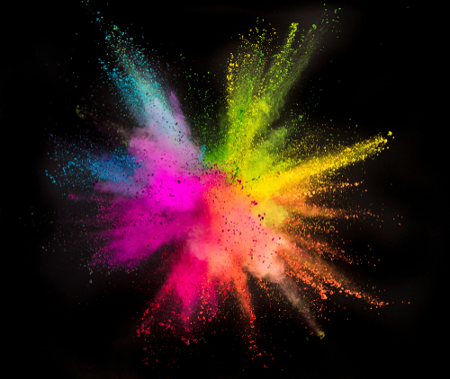
Colors And What They Mean
Now onto the fun part.
Have you ever noticed a quick change in your moods when you entered a certain room? Has seeing certain things in front of you alter your decisions in any way? Do colors really have some sort of power over us?
Apparently so.
Colors have been noted to change our moods. Colors can reach into that primal section of our brains and affect our mood, decision-making abilities, and mental state. Exploring coloring apps requires some basic knowledge about colors.
Here are some examples of colors and what they mean. Let’s start with the three primary colors:
Red
- Danger
- Energy
- Good Luck
- Happiness
- Importance
- Love
- Lust
- Passion
- Power
- Warning

Red is a primary color. As one of the strongest colors in visual terms, it is used to grab anyone’s attention immediately which must be the main reason why it is used for stop signs and other warnings. It’s also used to signify love. And judging by the number of couples on Valentine’s Day, it probably works just as well.
Blue
- Confidence
- Inspiration
- Intelligence
- Serenity
- Stability
- Tranquility
- Wisdom

Blue is also a primary color and because it reminds us of clear skies and the ocean, it has a very calming effect. That’s why it’s used in high-stress areas to bring the agitation levels down a bit. If that’s so, why are little boys so full of energy and rambunctiousness?
Yellow
- Cowardice
- Energy
- Fear
- Happiness
- Intellect

Yellow is the last of the triumvirate of primary colors. Although associated with fear and cowardice, yellow is still a very popular color. Most especially for products designed for young children. Those little tykes just love anything drenched in this hue.
These three were chosen as the primary colors because they mix with all other colors easily.
Green
- Ambition
- Fertility
- Freshness
- Greed
- Growth
- Healing
- Inexperience
- Jealousy
- Money
- Nature
- Newness
- Safety
- Sickness

Green is a secondary color. It is the resulting color coming from combining blue and yellow. It is a very relaxing color that we can find everywhere. One surprising thing about green is how many things it symbolizes. Some are related, some are contrasting. Mostly everything good is connected to the color green.
Black
- Death
- Elegance
- Evil
- Mystery
- Mourning
- Power

Black is considered a negative color because people connect it with grief, mourning, and death. And yet, it also portrays power, class, and style. Maybe that’s why business meetings where everyone’s wearing a suit is almost always a boring event.
White
- Cleanliness
- Faith
- Innocence
- Purity
- Perfection
- Softness
- Virginity

White symbolizes everything that is good, clean, and pure. This is perhaps the most faith-instilling color which is good when you’re lying down on a hospital bed surrounded by health practitioners telling you everything’s going to be “OK”. You wouldn’t want to be visited by a doctor all dressed in black before surgery, right?
Orange
- Creativity
- Enthusiasm
- Joy

Love it or hate it, orange is here to stay. In the early 90s, orange was the new yellow and it was a great way to attract the right kind of attention. It was just as hot as red but with a dash of non-threatening atmosphere that only yellow could provide. So, if you’re torn between the two primary hues, choose orange.
Purple
- Ambition
- Creativity
- Luxury
- Royalty

There’s just something about purple that makes anyone who wears it feel like a king or a queen. Change the value to a lighter tone and you get something soft and plush. Change it to a deeper color, add some bass into your voice and you can command legions with confidence.
Pink
- Femininity
- Love
- Sweetness
- Softness

Real men wear pink. Who knew that line wasn’t that far from the truth? Pink used to be a color associated with masculinity. Somewhere along the way, the color pink became a more feminine hue. What happened? Can’t we all just be represented by the color equally?
Whatever the color now represents, pink still remains a favorite color for a lot of men.
How Does The iColor Coloring Book App Help You Create The Perfect Color Palettes?
The iColor coloring book app offers hundreds of colors that you can use for your projects. These are solid colors and gradient colors.

For someone who believes in having something and not needing it rather than needing it and not having it, this is a good thing. The downside to having that many available colors are that people can get overwhelmed.
Understanding color theory and color palettes help you narrow your choices down to the very few that you will actually need to make the most powerful visual impact.
Get the most out of your experience exploring coloring apps with iColor today.
How To Get Started With Color Palettes
With so many great examples out there, it’s hard not to get intimidated. So how do you get started with creating color palettes that make you stand out from the rest of the crowd? Well, the best way is to always learn how the pros do it. And it starts with using the greyscale first.
Wait, what?
I want to see the colors!
Not shades of grey, black, and white!
Am I being scammed here?
No, this is essential when exploring coloring apps.

Like any great piece of art, it starts with the backbone or the draft. And in creating stunning color schemes, starting out in greyscale is akin to making the basic sketch of what will eventually be an awesome color palette.
So stick with me while we navigate the steps used by the pros.
Start With Greyscale
Working with grayscale removes all distractions. This gives you an uncluttered environment to work with.
The 60-30-10 Rule
This is just like the 80-20 rule but applied to color palettes. The last thing you want is to have an image that’s a mish-mash of colors with no semblance of coherence.
So, 60% of the color palette is your dominant hue, 30% is your secondary color, and 10%, your accent color. Now, before you start thinking that you can only use three colors, that’s not the case. You can actually use more than three. Try five colors. Just remember that the more colors you use, the more of a mess it’ll be if you don’t plan it correctly.
The objective here is to keep things in balance. Using the 60-30-10 rule allows your audience to move from one focal point to another with ease.
When All Else Fails, Look Towards Nature For Inspiration
Nature has the best color combinations. Take your cue from that. However wild the colors may look, it’ll always look natural.
Observe how the color shifts in a field of grass, check out some beautiful sunrises and sunsets, even the colors of a flower should be enough to give you a good idea of how certain colors will work with another.
When all else fails, look towards nature for inspiration when you’re exploring coloring apps. It never fails.
Conclusion
Choosing the perfect palette for any project will always result in amazing images. The goal is to achieve the perfect balance for the human eye to appreciate.
Understanding color theory, the meaning of colors, and how it affects people’s thoughts and moods also helps.
And this is great if you want people to appreciate your art more.
Using the iColor coloring book app is a great way to put all of these things into practice. And that’s why it’s worth your time when you start exploring coloring apps.
Related Questions
Why Is Pink And Purple Such A Perfect Color Combination For Mandalas?
Pink is the oldest color in the world, purple is the shade nearest to pink. A recent archaeological discovery just put pink in the oldest color category. This means we have a primal connection to the color which makes it an easy hue to choose when creating projects.
It’s either that or how pink and purple soften images and make them pleasing to the eye. And when you’re working with mandalas, you’d want something very appealing for your audience to appreciate.
What Commercial Importance Does Knowing Your Colors Provide?
A lot if you’re in advertising. Colors are important in the media. Colors are important in manufacturing. This affects people on a primal level and knowing color theory and how colors work gives you a step up over the competition. By tapping into your audience’s feelings you are giving yourself more chances of succeeding. So start exploring coloring apps and learn more today.
Why Aren’t The Colors Black And White Included In The Color Wheel?
You may have noticed that black and white are not colors on the color wheel. That means they’re not hues. So where do they fit in when it comes to mixing colors? Black and white have an important role to play. When you mix white, black, or both into one of the hues on the basic color wheel, you get variations. Those are what we call tints, tones, and shades. Think about that the next time you’re exploring coloring apps.
Start exploring coloring apps today by downloading the iColor app!